
Lindsay Wildlife
•
Lindsay Wildlife •

Project: Email newsletter
Creative Director: David Bergeron
Photography: Courtesy of Lindsay Wildlife Experience
Problem: Lindsay Wildlife Experience is an exhibit hall for wild animals, but also a hospital and non-profit. At the start of the COVID-pandemic in March 2020, everyone was encouraged to quarantine, and this forced many organizations, including Lindsay Wildlife to rethink how they approach their audience. They were looking for an easily-accessible form of communication where they can keep their members and supporters up-to-date on the latest news even if they couldn’t visit the exhibits.
Solution: What had originally been a printed newsletter consisting of 8-16 pages was converted into an email subscription newsletter. The email newsletter helped cut down costs by removing the printing and postage process, and the organization was able to send wildlife exhibit and hospital updates more frequently.
My role: worked as a visual designer to create an email newsletter template in line with Lindsay Wildlife’s brand guidelines. I also created a mockup of the newsletter using previously printed stories that they were able to use as a reference when the generation of the email newsletter was moved to in-house production.
Various Web Projects
•
Various Web Projects •
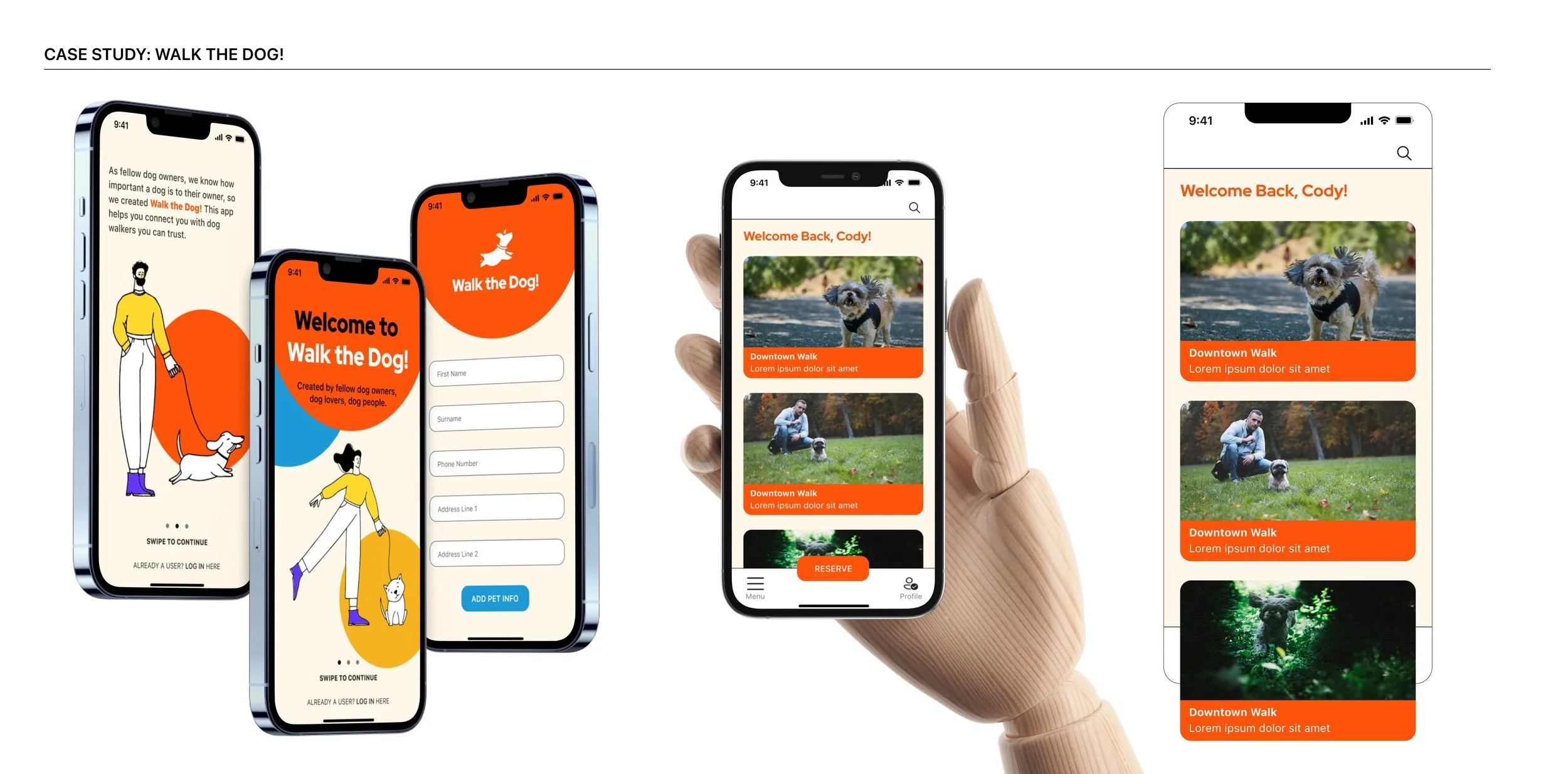
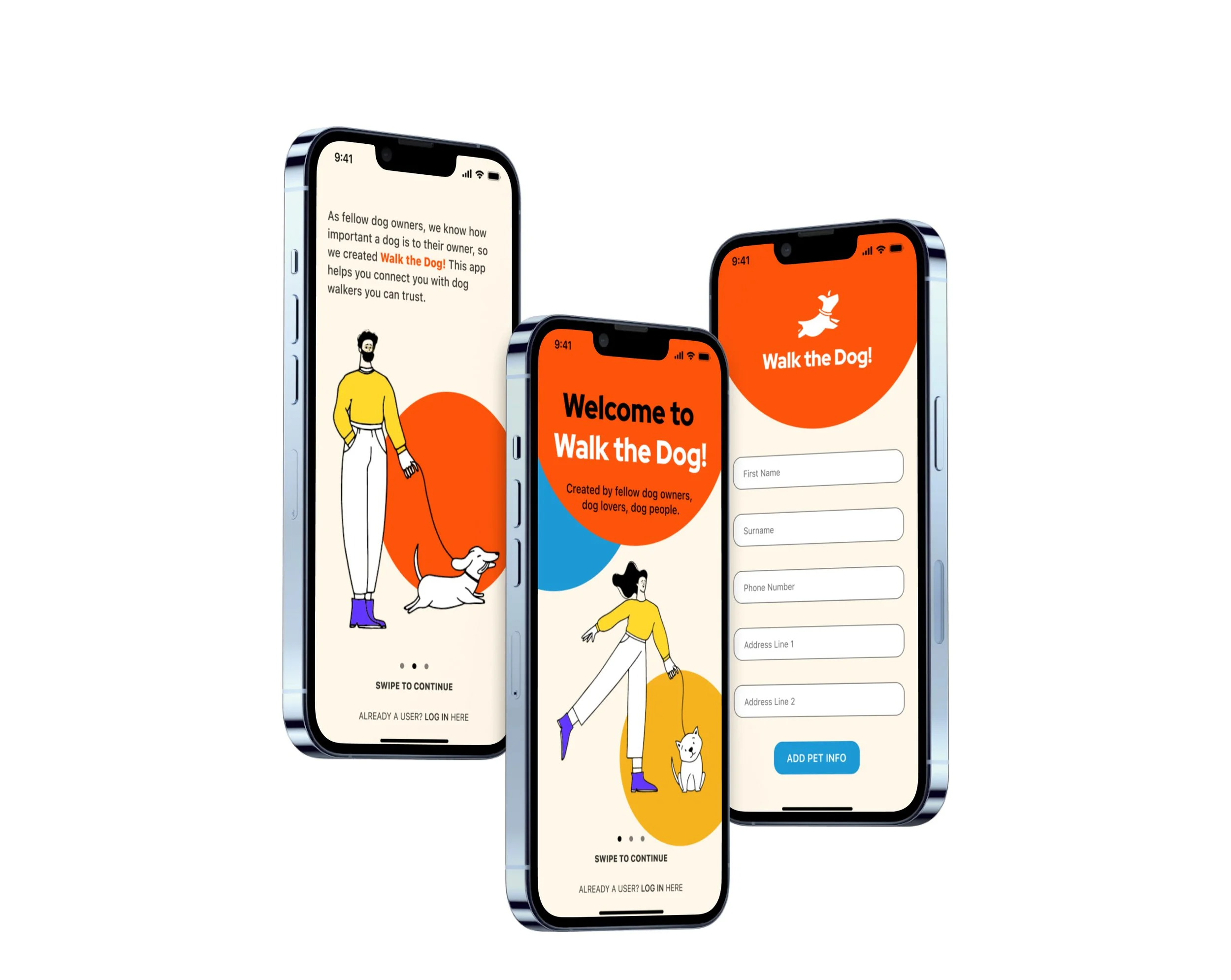
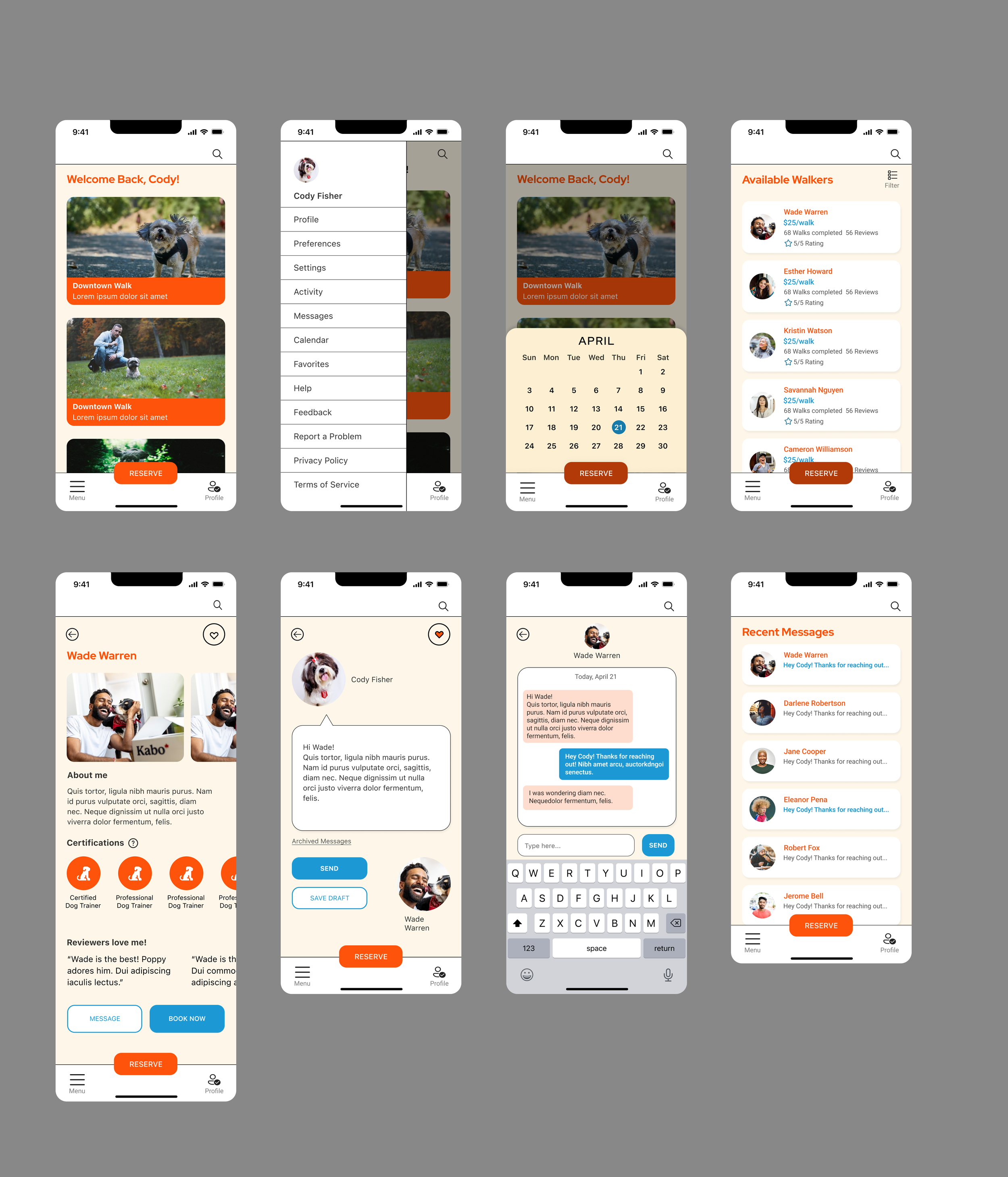
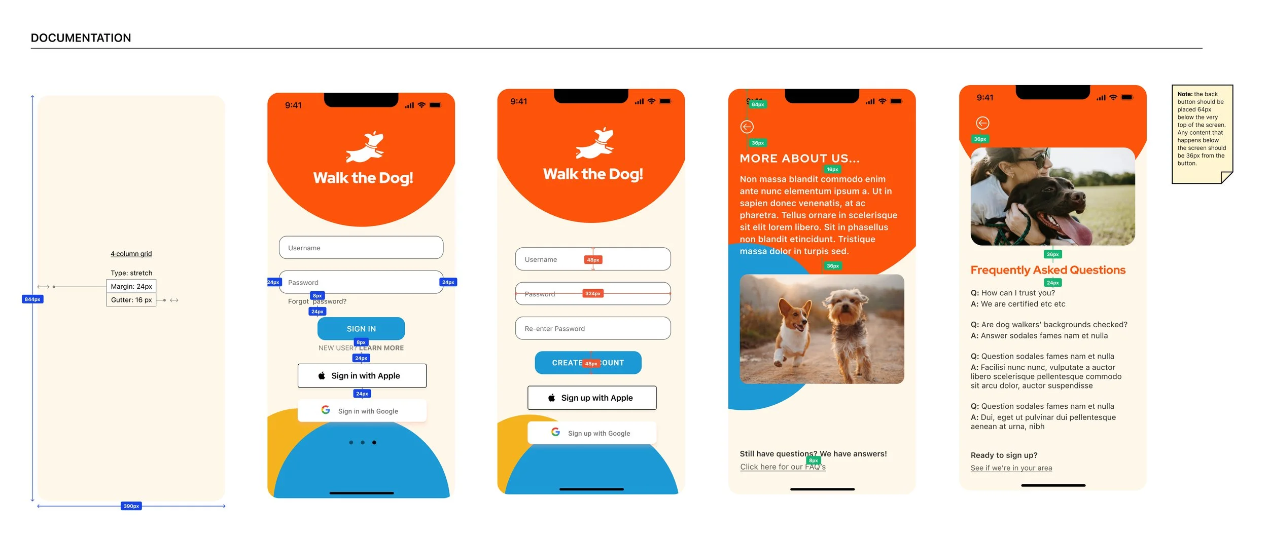
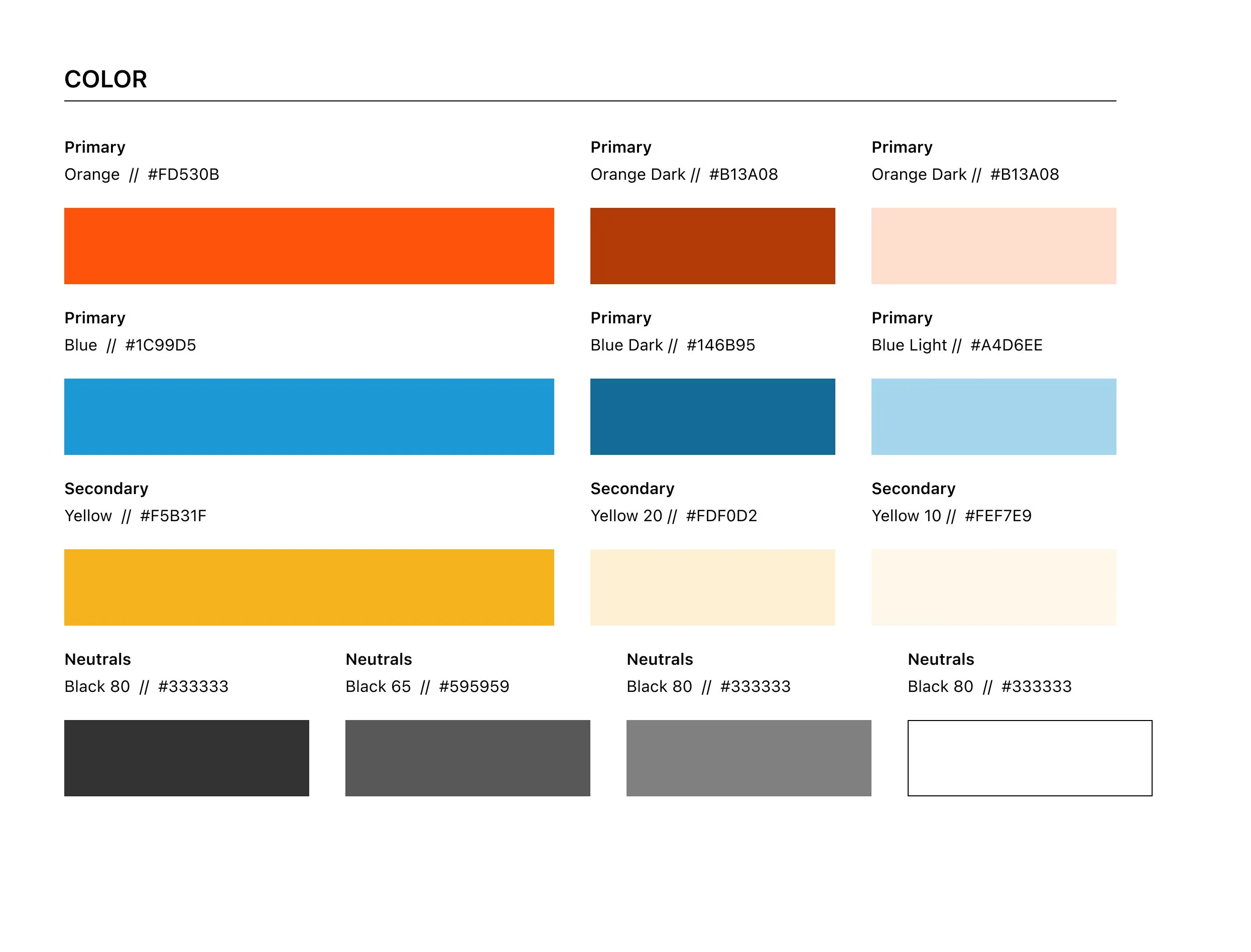
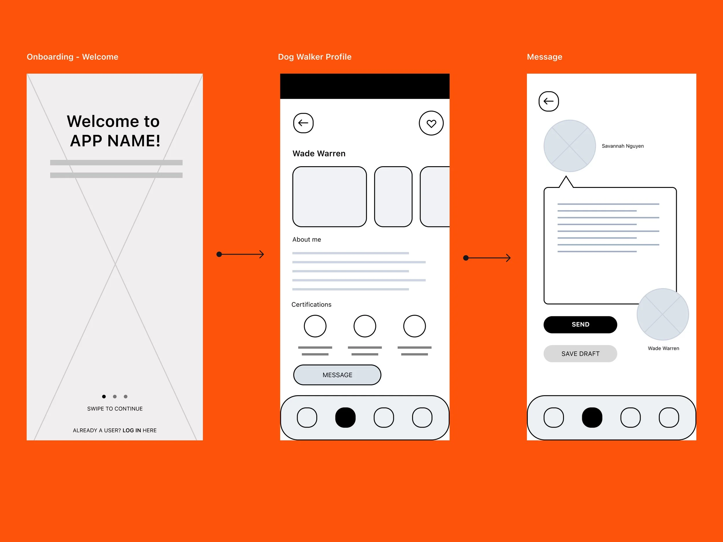
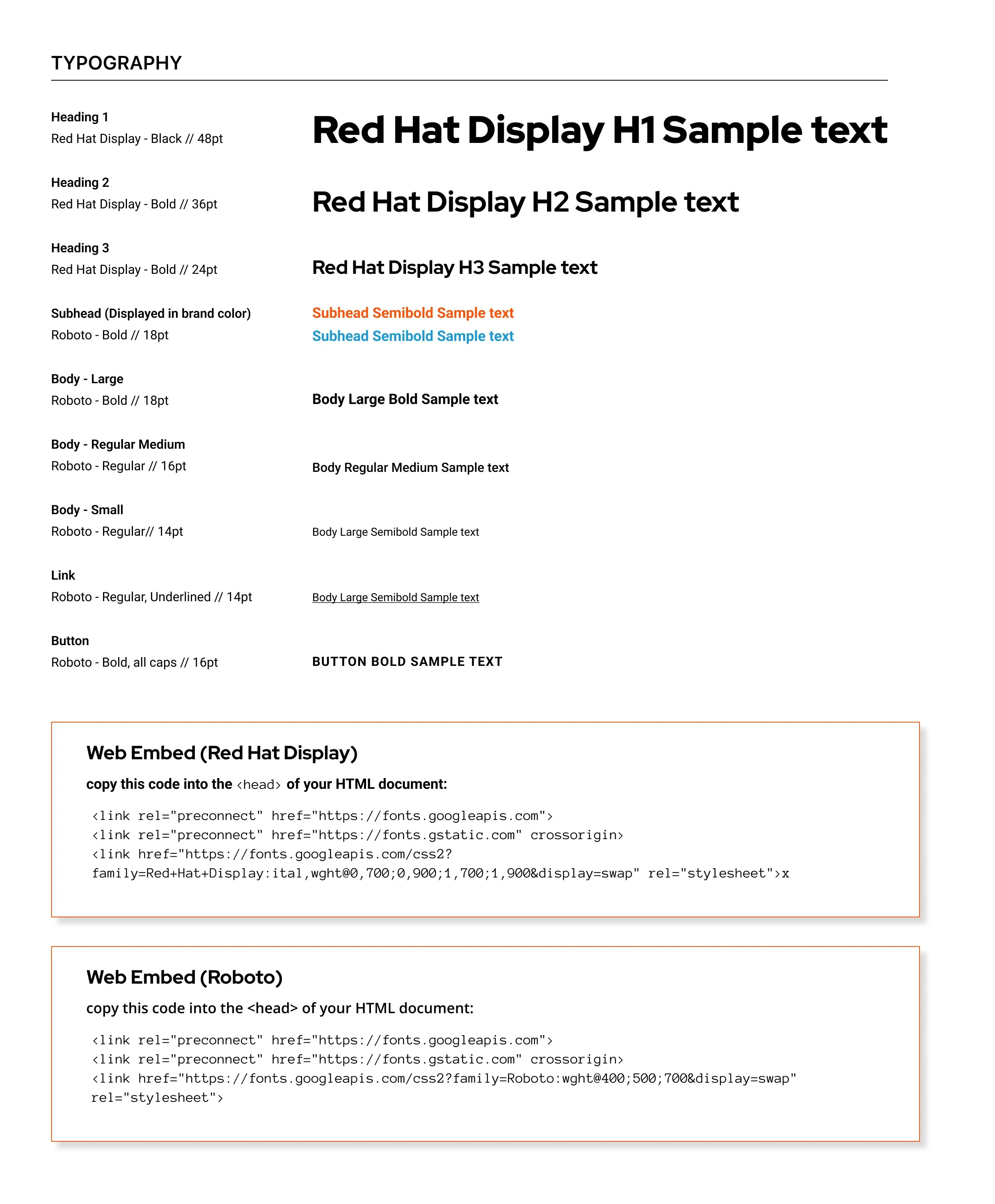
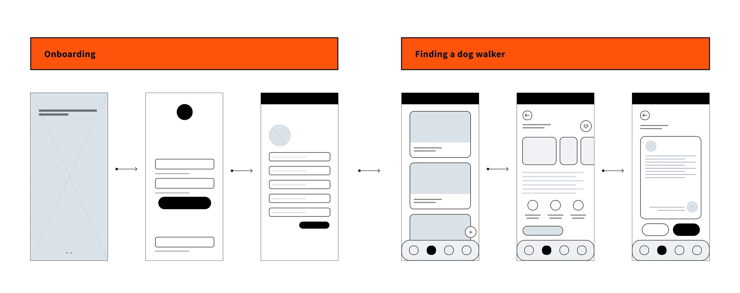
Project: Dog Walking App (Course Project From Product Design Certification)
Problem: Back in 2021, I had spent most of my professional design career working in print and publications. There had already been a shift from print to digital and many new design programs were rising to the surface, I felt like I was being left behind. I felt the need to structure my learning and growth in programs like Figma.
Solution: Enroll in a product design certification course. I applied my knowledge of design fundamentals and traditional graphic design to this course, where I learned the significance of wireframes, built components, and developed case studies. The product design course helped me adapt to the growing changes and needs of design, especially as more design moves into the digital realm.

Project: Top 5 website (Interactive Type course at The New School)
Problem: Tasked with creating a landing page where the majority of the information is readily available, how can we create a website where the type has a clear hierarchy, evokes the same emotions or feelings of the topic being discussed, and the page must be built from scratch using HTML and CSS.
Solution: Finding type that was the best fitting nature for the topic of Studio Ghibli films. For the main headers, I incorporated a Google font that was playful, bold, attention-grabbing, and yet still clear to read. This was paired with sans-serif font that is subtle, yet easy to digest in larger amounts of copy. These chosen fonts play well together and give the feel of a family-friendly genre, such as Studio Ghibli.